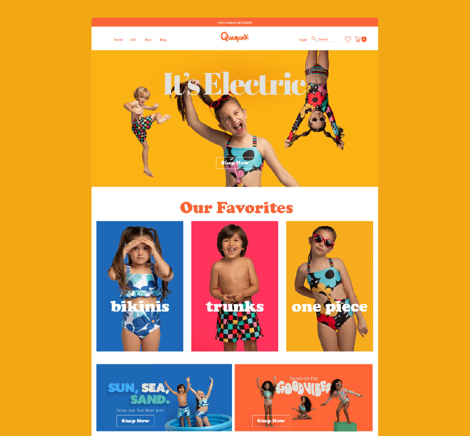
Quaquak is a kids’ swimwear brand that launched right after the pandemic in 2021. It sells it’s swimwear mainly through its online store directly to consumers and distributes in Colombia, Dominican Republic, Panama, and Puerto Rico through wholesale to boutiques specialized in children’s fashion.
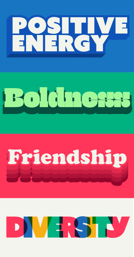
CHALLENGE: Quaquak wanted to create a brand that would carry a positive message for kids and resonate with moms. It had to feel playful and full of joy, so its name and identity needed to convey those feelings.
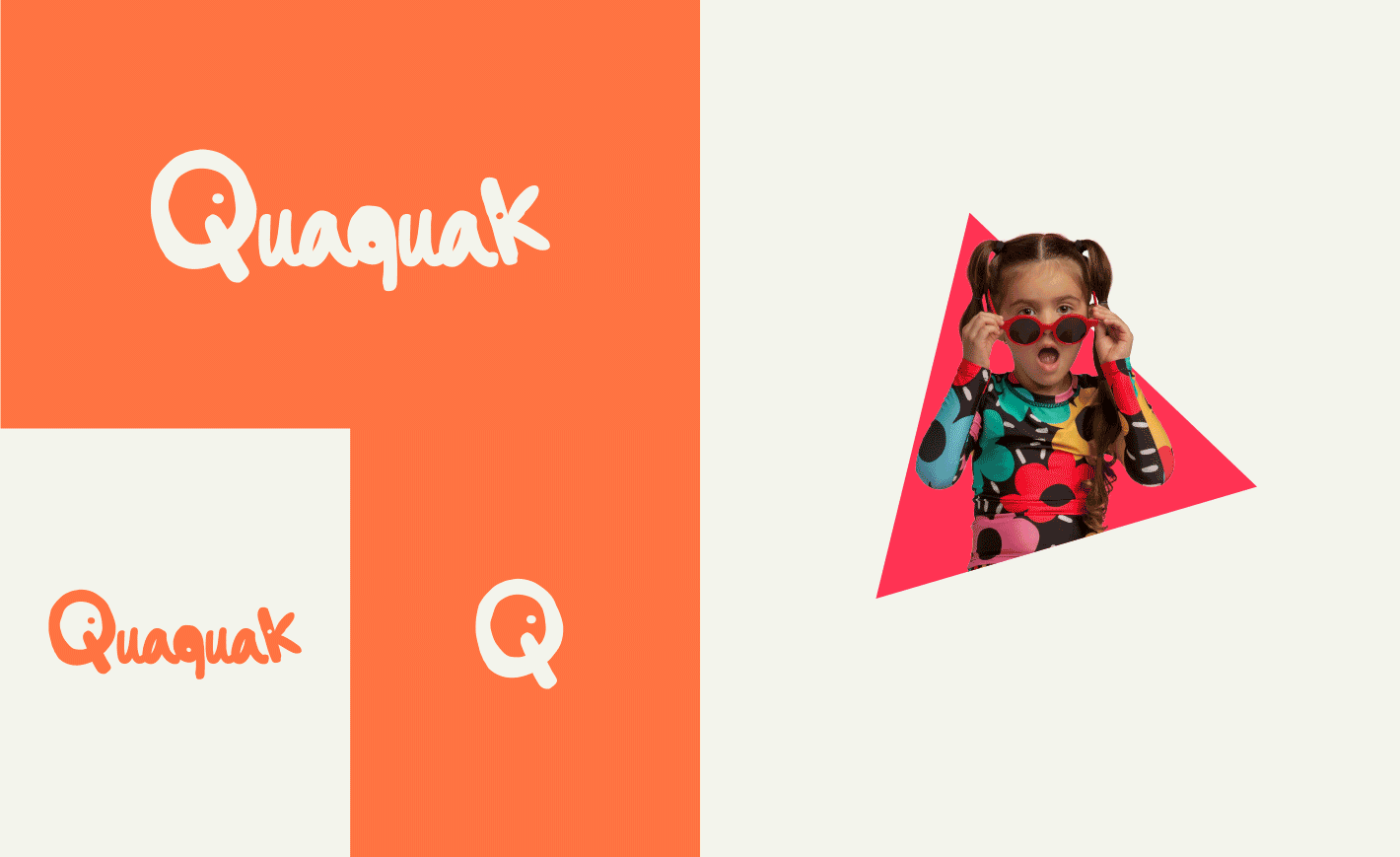
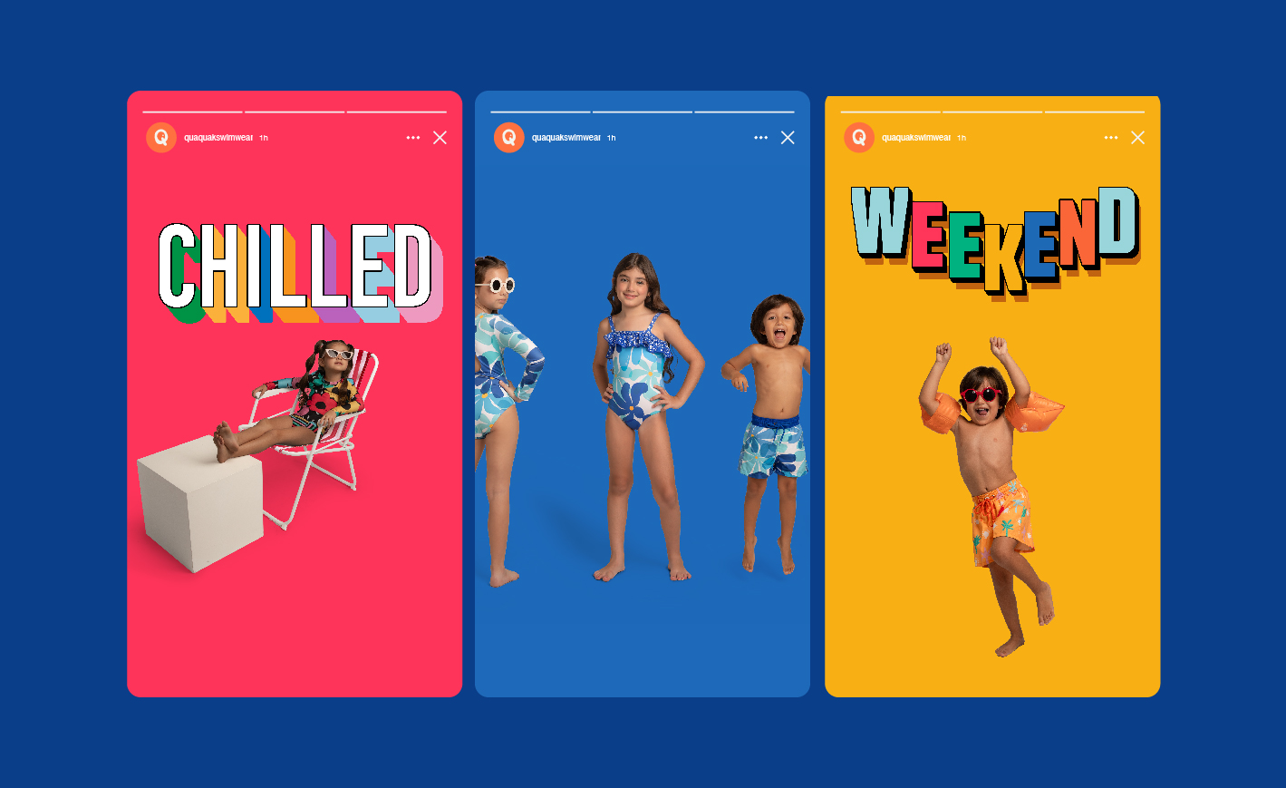
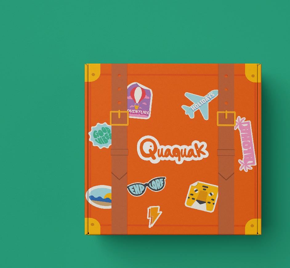
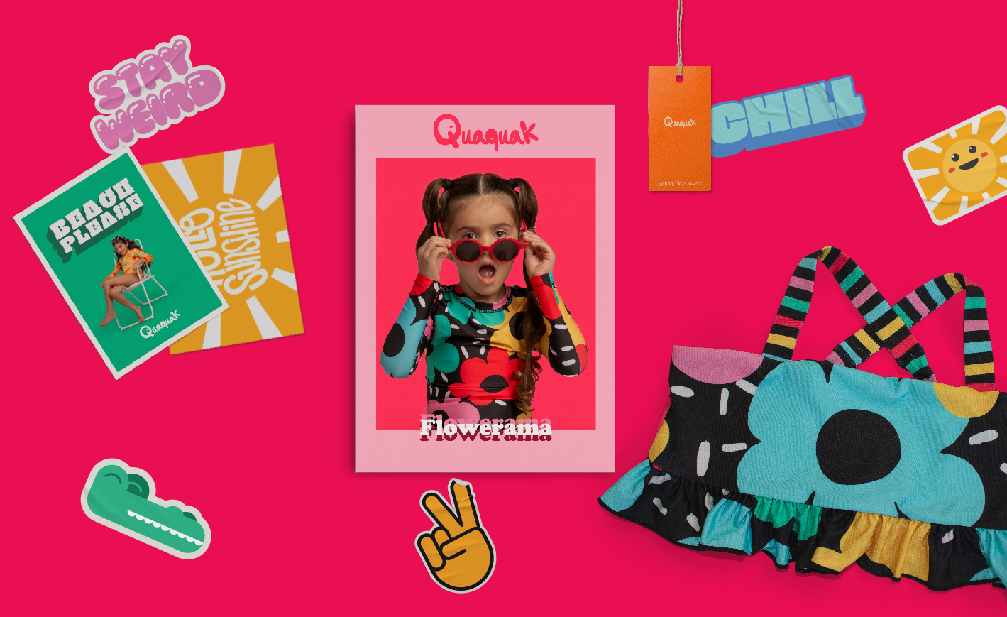
SOLUTION: For the wordmark’s style and design, we drew inspiration from children’s scribblings and doodles. Some of the letters of the typography took the shape of ducks and a bright color palette was the foundation for this brand’s look and feel. Developing the brand’s tone was also key, a series of messages illustrated with typography added playfulness, which aligns perfectly with the brand’s core values and plays a critical role in its communication.
CHALLENGE: Quaquak wanted to create a brand that would carry a positive message for kids and resonate with moms. It had to feel playful and full of joy, so its name and identity needed to convey those feelings.
SOLUTION: For the wordmark’s style and design, we drew inspiration from children’s scribblings and doodles. Some of the letters of the typography took the shape of ducks and a bright color palette was the foundation for this brand’s look and feel. Developing the brand’s tone was also key, a series of messages illustrated with typography added playfulness, which aligns perfectly with the brand’s core values and plays a critical role in its communication.